
First impressions can be deceiving in branding. What looks simple on the surface often carries layers of strategy, meaning and intention. Before dismissing a logo, it’s worth understanding the story it was designed to tell…
When FIFA unveiled the official logo for the 2026 FIFA World Cup, the internet reacted almost instantly.
“It looks lazy.”
“That’s it?”
“They just put the trophy over the number 26.”
For many people, it felt underwhelming compared to previous World Cup logos, which celebrated the culture, colours and artistic identity of their host nations.
At first glance, the new mark appeared almost too simple. But that’s the thing about great branding. Sometimes its brilliance isn’t immediately obvious. Sometimes you need to understand the story before you can appreciate the design.
More than a logo
If you judge the 2026 FIFA World Cup logo purely as a standalone graphic, you miss what it was actually designed to be.
Unlike every previous World Cup, the 2026 tournament wasn’t hosted by one nation. It was hosted by three countries, across 16 cities, making it the largest World Cup in history. Add to that the tournament’s expansion to 48 teams and suddenly the branding challenge was enormous.
Creating a single illustration that fairly represented Canada, Mexico and the United States, while remaining relevant across dozens of cultures, languages and host cities, must have felt almost impossible.
Instead, FIFA made an unexpected decision. Rather than designing a logo that tried to represent everything, they designed a system that could represent anything.
Simplicity by design
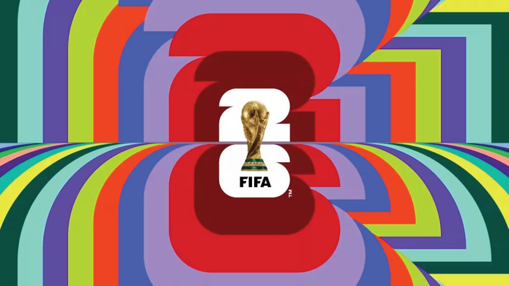
The central mark was remarkably straightforward – the iconic FIFA World Cup trophy sitting inside the number 26, creating the first World Cup emblem to feature the actual trophy rather than an abstract interpretation.
On its own, that simplicity sparked criticism. But simplicity wasn’t the destination. It was the foundation.
The master logo was intentionally designed to remain neutral so that all 16 host cities could build an identity around it.
The result was a series of unique interpretations rather than a one-size-fits-all brand.
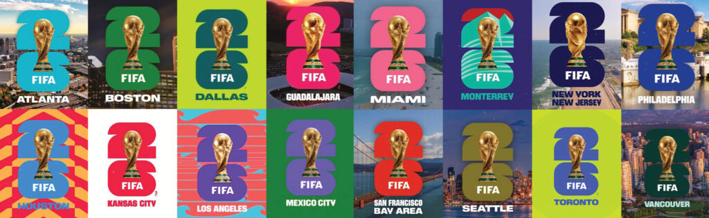
Take Los Angeles, for example, where the identity incorporated a stylised sun and ocean waves. Toronto’s version featured the city’s unmistakable skyline and the CN Tower, while Monterrey’s design celebrated the iconic Cerro de la Silla mountain that overlooks the city.
Miami embraced its vibrant coastal lifestyle with bold tropical colours and Art Deco-inspired patterns, Seattle drew inspiration from its evergreen landscapes and iconic Space Needle, and Mexico City’s identity celebrated its rich cultural heritage and artistic spirit through colourful graphic motifs.
The logo wasn’t meant to do all the work. It was designed to unlock an entire branding ecosystem.
The pitfalls of judging too quickly
Whenever a company unveils a new logo, social media fills with comments within minutes.
“I liked the old one better.”
“They probably paid millions for that?”
“I could have designed that in five minutes.”
Perhaps.
But what most people never see is the months of strategy, research, testing and problem-solving that happen before a single pixel is placed. Professional branding isn’t simply about making something attractive, it’s about solving business challenges:
- Who is the audience?
- Where will the logo appear?
- Will it scale from a stadium banner to a mobile screen?
- Can it grow with the business?
- Will it work internationally?
- Does it leave room for future campaigns?
Designing a flexible identity
The 2026 FIFA World Cup logo embodies one of the biggest shifts in modern branding – that a logo is no longer the brand itself, but the foundation of a much larger, more flexible identity system.
Think of brands like Google, Spotify or Airbnb. Their logos remain consistent, but their visual identities expand and adapt across countless platforms, campaigns and audiences.
The 2026 FIFA World Cup identity worked the same way. The master logo became the anchor that everything else evolved around.
Great branding reveals itself over time
Some of the world’s most iconic logos weren’t universally loved when they first appeared. Many faced criticism simply because people naturally resist change. Yet once those logos were seen consistently, supported by great campaigns and woven into memorable experiences, opinions changed. People stopped seeing a logo and started seeing everything the logo represented.
The FIFA World Cup 2026 identity followed a similar path – what initially looked minimal began revealing itself as an adaptable, scalable branding system capable of representing the biggest and most geographically diverse World Cup ever staged.
The real lesson
The next time a brand reveals a new logo, pause before deciding whether you like it or not.
Ask instead:
- What’s the possible story here?
- What problem is it looking to solve?
- What bigger system could it belong to?
At The Creative Café, that’s exactly how we approach every brand we build. We don’t start with colours or typography. We start by understanding your business, your audience and the story you want to tell. Only then do we create an identity that not only looks good but works hard too. The best logos aren’t always the ones that impress us at first glance. They’re the ones whose brilliance unfolds over time.


